Recent Guest Appearances The Morning Show for April 24, 2025 April 24, 2025 Hosted by Spencer Israel JC Parets Steve Strazza With special guest(s) Kenny Glick Grant Hawkridge The Morning Show for March 11 - Featuring Mike Hurley March 11, 2025 Hosted by Spencer Israel JC Parets Steve Strazza With special guest(s) Kenny Glick Mike Hurley Grant Hawkridge The Morning Show for December 12 - Featuring Grant Hawkridge December 11, 2024 Hosted by Spencer Israel JC Parets Steve Strazza With special guest(s) Grant Hawkridge The Morning Show - June 10 June 10, 2024 Hosted by Spencer Israel JC Parets Steve Strazza With special guest(s) Grant Hawkridge Ian Culley The Morning Show - March 1 March 1, 2024 Hosted by Spencer Israel JC Parets Steve Strazza With special guest(s) Grant Hawkridge Kenny Glick Alfonso Depablos, CMT Recent Articles Grant Hawkridge Still Their Market 💪 Today's number is... 12.4The Magnificent Seven have outperformed the S&P 500 excluding those same seven stocks, by 12.4 points this year.Here’s the chart: Let's break down what the chart... October 27, 2025 The Daily Number Grant Grant Hawkridge Skipping the Weak Season 📈 Today's number is... 2025In the current post-election year of the presidential cycle, the S&P 500 has stayed strong through a period that’s usually weak.Here’s the chart: Let's break down what the chart... October 24, 2025 The Daily Number Grant Grant Hawkridge Defensive Stocks Take the Lead 🛡️ Today's number is... 6.2%That’s the average stock gain for Utilities since the NYSE new highs list peaked on September 11, 2025.Here’s the chart: Let's break down what the chart shows:The chart... October 23, 2025 The Daily Number Grant
The Morning Show for April 24, 2025 April 24, 2025 Hosted by Spencer Israel JC Parets Steve Strazza With special guest(s) Kenny Glick Grant Hawkridge
The Morning Show for March 11 - Featuring Mike Hurley March 11, 2025 Hosted by Spencer Israel JC Parets Steve Strazza With special guest(s) Kenny Glick Mike Hurley Grant Hawkridge
The Morning Show for December 12 - Featuring Grant Hawkridge December 11, 2024 Hosted by Spencer Israel JC Parets Steve Strazza With special guest(s) Grant Hawkridge
The Morning Show - June 10 June 10, 2024 Hosted by Spencer Israel JC Parets Steve Strazza With special guest(s) Grant Hawkridge Ian Culley
The Morning Show - March 1 March 1, 2024 Hosted by Spencer Israel JC Parets Steve Strazza With special guest(s) Grant Hawkridge Kenny Glick Alfonso Depablos, CMT
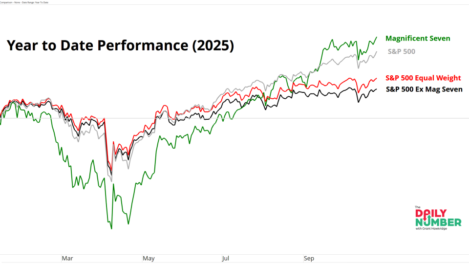
Grant Hawkridge Still Their Market 💪 Today's number is... 12.4The Magnificent Seven have outperformed the S&P 500 excluding those same seven stocks, by 12.4 points this year.Here’s the chart: Let's break down what the chart... October 27, 2025 The Daily Number Grant
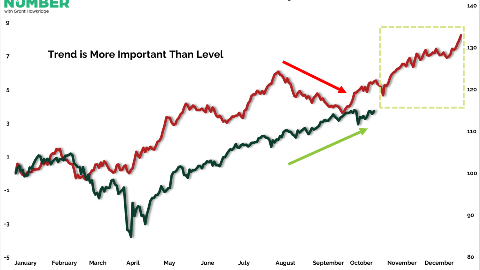
Grant Hawkridge Skipping the Weak Season 📈 Today's number is... 2025In the current post-election year of the presidential cycle, the S&P 500 has stayed strong through a period that’s usually weak.Here’s the chart: Let's break down what the chart... October 24, 2025 The Daily Number Grant
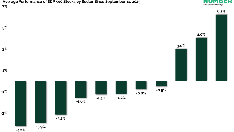
Grant Hawkridge Defensive Stocks Take the Lead 🛡️ Today's number is... 6.2%That’s the average stock gain for Utilities since the NYSE new highs list peaked on September 11, 2025.Here’s the chart: Let's break down what the chart shows:The chart... October 23, 2025 The Daily Number Grant